Few years ago I made a simple tutorial to explain how to build a dark mode theme switcher in CSS . Today I want to update it and show you how to do it in SCSS and how to use the default system theme.
Update 23/12/2023: After many researches I updated this tutorial to use only pure CSS (and SCSS) to do the switch between the themes. The JS part is now only used to save the user’s choice and is purely optional.
Update 24/12/2023: I did some further testing (see original Codepen here
) and I found that on Safari it is not possible to free a CSS variable (with the trick --current-dark-theme: var(--initial-dark-theme,) var(--initial-light-theme, initial);). On Firefox and Chrome, passing an empty value will work and the variable will be considered as non existent. So I updated the code to use a double checkbox system, one that is for managing the dark mode when the default system theme is light and the other one for managing the light mode when the default system theme is dark. It works pretty smoothly across all browsers even if it’s maybe not the cleanest solution.
You can check the different version of this blog post on Github to see all the updates.
Building the HTML
First, we need to create a simple HTML structure with a checkbox and a label. The checkbox will be used to switch the theme and the label will be used to style the button.
 1<input type="checkbox" id="switch-light" />
 2<input type="checkbox" id="switch-dark" />
 3<div class="app">
 4    <div class="container">
 5        <h1>My website</h1>
 6        <p>Lorem ipsum dolor sit amet consectetur adipisicing elit. Quisquam, voluptatum.</p>
 7
 8        <label for="switch-light" class="switch-light">
 9            <p class="btn btn-primary dark">Switch to dark</p>
10            <p class="btn btn-primary light">Switch to light</p>
11        </label>
12
13        <label for="switch-dark" class="switch-dark">
14            <p class="btn btn-primary dark">Switch to dark</p>
15            <p class="btn btn-primary light">Switch to light</p>
16        </label>
17    </div>
18</div>
One important thing to notice in the HTML is that the you need to wrap your content that will be themed in a div (here named app) and place it after the checkbox. This is because we will use the ~ selector in CSS to style the content when the checkbox is checked.
Side note: I used bootstrap in the example to quickly style the different elements.
Let’s create our switcher in pure SCSS
On the SCSS part, we will start by declaring the different colors we will use for the light and dark theme.
Then we will use the prefers-color-scheme media query to detect if the user has a dark mode enabled on his system. If it’s the case, we will set the --initial-dark-theme variable to initial and the --initial-light-theme to nothing. If the user has a light mode enabled, we will do the opposite.
$bg-dark: #112f41;
$bg-light: #fff;
$color-dark: #fff;
$color-light: #000;

@media (prefers-color-scheme: light) {
    :root {
        --initial-light-theme: initial;
        --initial-dark-theme: ;
        --current-light-theme: initial;
        --current-dark-theme: ;
    }

    .switch-light {
        display: none;
    }
}

@media (prefers-color-scheme: dark) {
    :root {
        --initial-light-theme: ;
        --initial-dark-theme: initial;
        --current-light-theme: ;
        --current-dark-theme: initial;
    }

    .switch-dark {
        display: none;
    }
}
Next, we will use the :checked pseudo-class to detect if the user has clicked on the button to switch the theme. If it’s the case, we will set the --current-dark-theme variable to the --initial-light-theme variable and the --current-light-theme to initial. If the user has clicked on the button to switch to the light theme, we will do the opposite.
Ok that’s a lot of variables, let’s see how it look like.
#switch-light[type='checkbox']:checked ~ .app {
    --current-dark-theme: var(--initial-light-theme, initial);
    --current-light-theme: initial;
}

#switch-dark[type='checkbox']:checked ~ .app {
    --current-dark-theme: initial;
    --current-light-theme: var(--initial-dark-theme, initial);
}
Let me explain a bit a particularity of the var() function. If you pass a variable to the function, it will return the value of this variable.
In the event that the variable is not set or invalid, it will return the value of the second parameter.
But, if the variable is an empty value, a space , the function will not return anything, and the fallback will be ignored, which is a funny trick.
Pretty simple right? Now we need to create a function to use the different variables we created.
@function darkMode($lightValue, $darkValue) {
    @return var(--current-light-theme, #{$lightValue}) var(--current-dark-theme, #{$darkValue});
}
The function will return the light or dark value depending on the current theme. This function can then be used inside any CSS property.
#switch-light[type='checkbox'],
#switch-dark[type='checkbox'] {
    display: none;
}

.switch-dark .dark,
.switch-light .light {
    display: darkMode(block, none);
}

.switch-dark .light,
.switch-light .dark {
    display: darkMode(none, block);
}

.app {
    height: 100vh;
    width: 100vw;

    background-color: darkMode($bg-light, $bg-dark);
    color: darkMode($color-light, $color-dark);

    --title-color: #{darkMode(blue, green)};
}

h1 {
    color: var(--title-color);
}
As you can see in the example above, we can use the function inside any CSS property. We can also use it to create a new CSS variable like I did with the --title-color variable. That way you can for instance have generic color variables for the background or the text color for example.
How to save the user’s choice?
In order to save the user’s choice, we can use the localStorage to store the theme.
document.addEventListener('DOMContentLoaded', () => {
    const preferredSystemTheme = window.matchMedia('(prefers-color-scheme: dark)').matches ? 'dark' : 'light';
    let savedTheme = localStorage.getItem('theme-mode') ?? preferredSystemTheme;

    const themeSwitcher = document.querySelector(`#switch-${preferredSystemTheme === 'dark' ? 'light' : 'dark'}`);
    if (preferredSystemTheme !== savedTheme) {
        themeSwitcher.checked = true;
    }

    themeSwitcher.addEventListener('click', () => {
        localStorage.setItem('theme-mode', savedTheme === 'dark' ? 'light' : 'dark');
        savedTheme = localStorage.getItem('theme-mode');
    });
});
The code above will check if the user has a dark mode enabled on his system and if it’s the case, it will set the savedTheme variable to dark. If the user has a light mode enabled, it will set the savedTheme variable to light. Then, if the user has a different theme saved in the localStorage, it will set the checkbox to checked. Finally, when the user will click on the checkbox, it will save the new theme in the localStorage.
Now the demo
That’s it! We have a dark mode theme switcher in SCSS. You can see the result in the CodePen below.
Bonus
If you want to test in your browser the system theme (this is for Chrome): inspect the page, go to the “Rendering” tab and change the theme to “Dark”.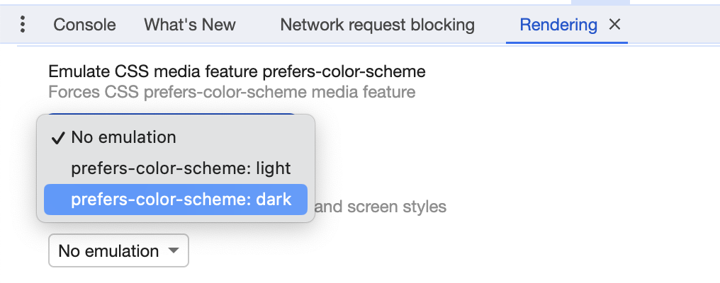
Enjoy and let me know what you think in the comments below!